
For decision-focused meetings, choose boardroom or hollow square. For training, go classroom or U-shape. For high-capacity presentations, theater is your friend. For quick team huddles, nothing beats a lounge or cluster setup.
That’s the short version. Now let’s make sure you never walk into a room and just… wing it.
Before you commit to any arrangement, measure the room’s footprint, check your AV sightlines, and remember that structural elements and AV footprints commonly reduce usable capacity by roughly 15–25% versus what any online calculator tells you. That gap matters more than most planners expect.
Quick objective-to-layout map:
- Decision-making (6–16 people): Boardroom or hollow square
- Training or instruction (10–30 people): Classroom or U-shape
- Presentation to a large group (25+ people): Theater/auditorium
- Workshop or brainstorming (8–20 people): Clusters or crescent/cabaret
- Networking or social: Banquet or lounge
- Quick 30-minute planning session (4–8 people): Huddle or boardroom
Table of Contents
- What are the most common meeting room layouts?
- How do you choose the right layout for your meeting?
- How do you calculate meeting room capacity?
- What does a solid AV and hybrid setup checklist look like?
- What mistakes do meeting room planners make most often?
- Why meeting objective is the single biggest layout driver
- How does decor and ambiance affect meeting outcomes?
- How do you adapt a layout mid-meeting when things change?
- Key Takeaways
- The layout that nobody talks about
- Centro’s meeting rooms are built for this
- Useful sources and tools
What are the most common meeting room layouts?
Every layout has a personality. Pick the wrong one and your collaborative workshop turns into a lecture nobody asked for.
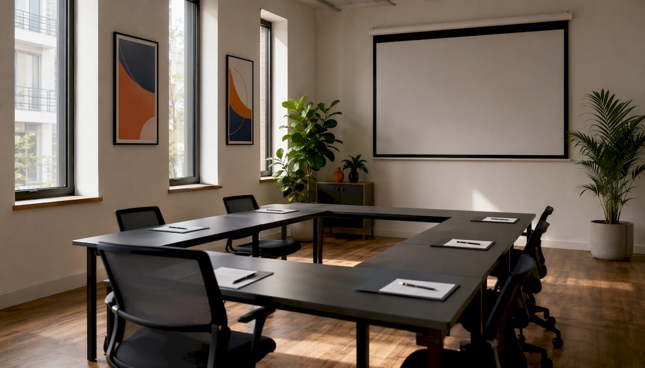
| Layout | Visual Shape | Best For | Capacity Rule-of-Thumb | Sightlines | Collaboration Level | Reconfiguration Time |
|---|---|---|---|---|---|---|
| Boardroom | Rectangular table, chairs all sides | Decisions, executive meetings | 1 person per 25–30 sq ft | Excellent | High | Low (fixed) |
| U-Shape | Tables in open U, presenter at open end | Training, interactive sessions | 1 person per 30 sq ft | Good | High | Medium |
| Classroom | Rows of tables facing front | Instruction, note-heavy sessions | 1 person per 15–20 sq ft | Good (front rows) | Low | Medium |
| Theater | Rows of chairs, no tables | Large presentations, keynotes | 1 person per 8–12 sq ft | Good | Low | Low |
| Hollow Square | Tables forming a closed square | Panel discussions, group leadership | 1 person per 30 sq ft | Good | High | Medium |
| Banquet | Round tables scattered | Meals, networking, small groups | 1 person per 12–15 sq ft | Variable | Medium | Medium |
| Crescent/Cabaret | Round tables, chairs on one side only | Workshops with front presentation | 1 person per 15 sq ft | Good | Medium-High | Medium |
| Horseshoe | U-shape with closed bottom | Small group discussion, demos | 1 person per 28 sq ft | Excellent | High | Medium |
| Workshop/Clusters | Small tables grouped | Brainstorming, breakout work | 1 person per 20–25 sq ft | Variable | Very High | Fast |
| Huddle/Lounge | Informal seating, no fixed layout | Quick check-ins, informal chats | 1 person per 25–30 sq ft | Casual | Very High | Very Fast |
A couple of quick examples to make this concrete. Eight people need a 30-minute planning session? A boardroom or huddle setup in a 200–250 sq ft room works perfectly. Running a half-day training for 20 people? You need at least 600 sq ft in classroom style, or closer to 700 sq ft in U-shape once you account for the presenter’s area.
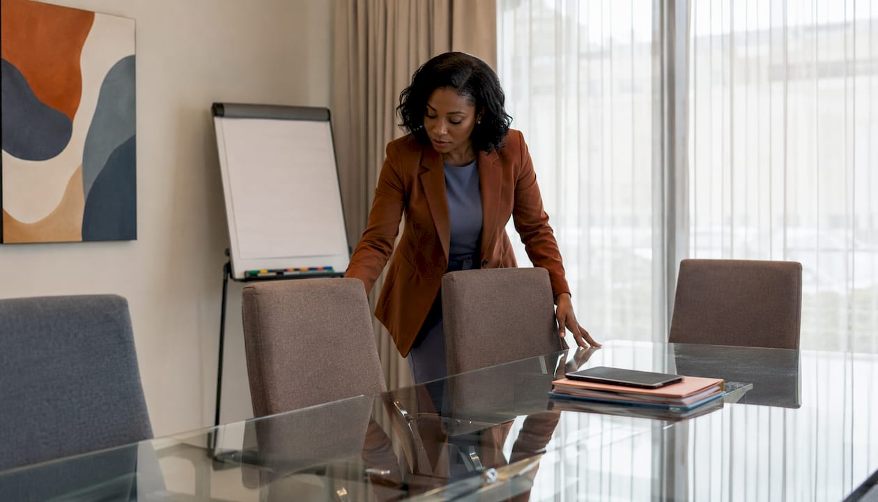
Furniture layout directly shapes how much people talk to each other, which is why crescent and cluster setups consistently outperform straight classroom rows for workshops.
How do you choose the right layout for your meeting?
Meeting objective should always drive layout choice, not habit, not what was set up last time, and definitely not what looks nice in a photo. Here are the five factors that actually matter:
- Meeting objective. Are you deciding, teaching, presenting, brainstorming, or socializing? Each goal has a natural layout match (see the table above).
- Audience size. A theater setup for six people feels like a punishment. A huddle for forty is chaos. Match the scale.
- Room dimensions and shape. A long, narrow room kills U-shape and hollow-square options. A square room is the most versatile.
- AV and hybrid needs. If remote participants are joining, screen placement and camera angle become non-negotiable constraints, not afterthoughts.
- Flexibility and modularity. Will the meeting shift from presentation to breakout? Plan for that transition before it happens.
Five questions to ask before you finalize anything:
- What is the confirmed headcount (not the invited count)?
- How much interaction do participants need with each other versus the presenter?
- Does anyone need a writing surface, or is this a listen-and-discuss session?
- Are hybrid participants joining, and from how many locations?
- Is catering or service needed, and where does it go?
Accessibility matters too. ADA-compliant aisle widths require at least 36 inches of clear circulation path, and wheelchair-accessible seating needs 60 inches of turning radius. Build those into your layout before you count seats.
How do you calculate meeting room capacity?
Most planners overestimate how many people a room can hold. The formula is simple; the discipline to apply it is not.
Step 1: Get the gross square footage. Length × width in feet.
Step 2: Subtract fixed footprints. AV equipment, staging, a credenza, a projector cart, a whiteboard on wheels. These eat 15–25% of your usable space before a single chair appears.
Step 3: Apply the layout’s sq ft per person.
| Layout | Sq Ft per Person |
|---|---|
| Theater | 8–12 |
| Classroom | 15–20 |
| Banquet/Crescent | 12–16 |
| Boardroom/U-Shape/Horseshoe | 25+ |
| Workshop Clusters | 20–25 |
| Huddle/Lounge | 25–30 |
Three worked examples:
- Small room (10 × 12 ft = 120 sq ft). Subtract 20% for AV and circulation: 96 usable sq ft. Theater: 8–12 people (tight). Boardroom: 3–4 people (comfortable). Huddle: 3–4 people.
- Medium room (20 × 25 ft = 500 sq ft). Subtract 20%: 400 usable sq ft. Theater: 33–50 people. Classroom: 20–26 people. U-shape: 11–16 people.
- Large room (40 × 60 ft = 2,400 sq ft). Subtract 20%: 1,920 usable sq ft. Theater: 160–240 people. Classroom: 96–128 people. Banquet: 106–160 people.
Capacity calculators are a useful starting point, but they consistently overestimate because they ignore staging, catering tables, AV carts, and the circulation paths people actually need to move around. Always run your own subtraction. Benchmark dimensions for small to medium rooms suggest a minimum of 100 sq ft for a 4-person room, 150 sq ft for 6 people, and 250–300 sq ft for 8–12 people when using a boardroom or U-shape configuration.
What does a solid AV and hybrid setup checklist look like?
Bad camera angles are the number one reason remote participants feel like they’re watching a meeting through a mail slot. Here’s how to avoid that.
Pre-meeting AV checklist:
- Test internet connectivity and have a backup hotspot ready.
- Check microphone coverage: omnidirectional mics for round tables, directional arrays for U-shape and classroom.
- Confirm camera angle: camera should sit at roughly eye level for seated participants, aimed at the full group, not the ceiling.
- Verify display visibility from every seat, including the back row and any side seats.
- Test screen sharing and video platform before anyone arrives.
- Confirm power outlets are accessible at every seat (or that extension cords are taped down safely).
Three quick placement templates:
- Boardroom: Screen at the head of the table, camera mounted just above or below the screen center, aimed down the table length. Remote participants see the same frontal view as in-person attendees.
- U-shape: Screen at the open end of the U, camera centered above the screen. Avoid placing the camera at the side of the room — side-profile views make remote participants feel like they’re eavesdropping on someone else’s meeting.
- Theater: Screen(s) at the front, camera at the back of the room aimed forward, or a second camera at the front aimed at the audience for Q&A segments.
Pro Tip: Switch from workshop clusters to presentation rows in under 10 minutes by using lightweight, modular furniture with locking casters. Pre-assign two people to handle the reset so it doesn’t become a group project nobody wants to lead.
What mistakes do meeting room planners make most often?
These are the ones that show up again and again, like that one colleague who books the room for “30 minutes” and is still in there an hour later.
- Overcrowding. Squeezing 20 people into a theater-style room sized for 12 means nobody can reach the door without a full evacuation drill. Fix: use the capacity formulas above and subtract first.
- Poor sightlines. If the presenter stands in front of the screen, half the room sees a silhouette. Fix: move the presenter to the side or use a second display.
- Ignoring circulation and ADA paths. Chairs pushed together block emergency exits and wheelchair access. Fix: keep 36-inch minimum aisles, always.
- Wrong screen orientation for hybrid. Screens behind the presenter mean remote participants see the back of someone’s head. Fix: screen parallel to the primary row, presenter to the side.
- Insufficient power and outlets. Everyone has a laptop, a phone, and probably a ring light now. Fix: plan one outlet per two seats minimum, or use power strips taped to the floor.
- Bad acoustics and lighting. Hard floors and bare walls create echo; overhead fluorescent lighting flattens everyone on camera. Fix: add soft furnishings where possible, use warm supplemental lighting near the camera’s field of view.
Test the setup 10–15 minutes before start. Walk to three random seats, sit down, and check: Can you see the screen? Can you hear clearly? Open the video call and look at what the remote view actually shows. It takes five minutes and saves a lot of awkward “can you hear me now?” energy.
Why meeting objective is the single biggest layout driver
Choosing a layout for aesthetics or habit reduces engagement and collaboration. That’s not an opinion; it’s the consistent finding from workplace design research. The layout signals to participants what kind of meeting this is before anyone says a word.
Here’s a reusable template you can copy for any room:
Room X (dimensions): [your room size here]
- Presentation mode: Theater or classroom
- Workshop/brainstorming mode: Clusters or crescent
- Hybrid decision meeting: Boardroom or U-shape with screen at head of room
Last-minute layout fixes are easier than most planners think when furniture is modular. The real cost is not the reconfiguration time; it’s not having a plan for it in advance.
Pro Tip: Note your reconfiguration time for each layout transition in your room’s setup guide. If boardroom-to-clusters takes 8 minutes with two people, build that buffer into your schedule. Nobody wants to start a workshop while someone is still dragging tables.
How does decor and ambiance affect meeting outcomes?
The room’s look and feel do more work than most people give them credit for. A sterile white box with fluorescent lighting is fine for a quick status update. It’s terrible for a creative brainstorm or a client pitch.
For decision-making and executive meetings, keep it clean and minimal. Neutral tones, good task lighting, and zero visual clutter help people focus on the problem, not the decor. A single piece of art or a plant adds warmth without distraction.
For workshops and brainstorming sessions, warmer tones and writable surfaces (whiteboards, glass walls, sticky-note-friendly paint) actively encourage participation. Natural light helps too. People think more freely when they’re not sitting under a fluorescent hum.
For client presentations and pitches, the room should reflect your brand’s quality. That means clean lines, good lighting that flatters everyone on camera, and a screen that doesn’t wash out in daylight. Acoustic panels on the walls aren’t just functional; they also signal that you take the meeting seriously.
For networking and social events, banquet and lounge setups benefit from warmer, lower lighting and flexible furniture that people can rearrange themselves. The goal is to make the room feel like a place people want to stay in, not escape from.
How do you adapt a layout mid-meeting when things change?
Sometimes the agenda shifts. The “quick update” becomes a working session. The workshop turns into a presentation. It happens. Here’s how to handle it without derailing everything.
Signal the shift clearly. Tell the room what’s changing and why. “We’re going to break into small groups for the next 20 minutes” lands better than silently rearranging chairs while people stare at their phones.
Move the minimum. If you’re going from boardroom to clusters, you don’t need to reset the whole room. Push the central table to one side and pull chairs into groups of four. Done in three minutes.
Reassign the screen. If the meeting shifts from presentation to discussion, turn the screen off or move it to a neutral position so it stops dominating the room’s attention. A blank screen at the front of a discussion-style meeting is like a TV left on in the background.
Use the furniture you have. Modular tables on casters are the obvious answer, but even fixed furniture can be worked around. Flip chairs to face a different direction, use a whiteboard as a temporary divider, or move the group to a different part of the room entirely.
The key is having a plan before you need it. If you know the meeting might shift, set up for the harder configuration first and simplify from there.
Key Takeaways
Meeting objective is the single most important factor in choosing a layout; every other decision flows from it.
| Point | Details |
|---|---|
| Objective drives layout | Match the layout to the meeting’s goal: boardroom for decisions, theater for presentations, clusters for workshops. |
| Measure and subtract | Usable capacity is 15–25% less than gross square footage once AV, staging, and circulation are removed. |
| Hybrid needs screen placement | Place screens parallel to the primary row and cameras at eye level; side-profile views disconnect remote participants. |
| Test AV before start | Walk three random seats and check the remote view 10–15 minutes before the meeting begins. |
| Centro for flexible rooms | Centro’s meeting rooms in Marbella are hybrid-ready and configurable for multiple formats in a single day. |
The layout that nobody talks about
Here’s a take you won’t find in most guides: the biggest meeting room mistake isn’t choosing the wrong layout. It’s choosing the right layout and then ignoring it five minutes in because the presenter decided to stand in the corner, the screen got blocked by a laptop, and the remote participants got a lovely view of the ceiling tiles.
Layout is a system, not a decoration. The table arrangement, the screen position, the camera angle, and the lighting all have to work together. Change one element without adjusting the others and the whole thing falls apart. A boardroom setup with the camera pointing at a window is worse than no camera at all.
The other thing worth saying: most meeting rooms are set up for the presenter’s comfort, not the participants’. The presenter can see everyone. The people at the far end of a long boardroom table often can’t see the screen, can’t hear the remote participants clearly, and are essentially attending a different meeting. If you’re planning the room, sit in the worst seat first. Fix that seat. Everything else will follow.
Centro’s meeting rooms are built for this
If you’ve just mapped out your ideal layout and realized your current space can’t deliver it, that’s exactly the problem Centro solves. Centro’s flexible meeting rooms in Marbella come with modular furniture, built-in AV, and a team that can help you configure the room for whatever format your meeting needs, whether that’s a boardroom session for six or a workshop for twenty.
No hunting for extension cords. No arguing about whether the screen is visible from the back row. The spaces are designed for hybrid-ready setups, so remote participants get a proper view and good audio without you having to duct-tape a webcam to a tripod. Check availability and view the room options to find the right fit for your next meeting.
Useful sources and tools
- Envoy: The ultimate guide to meeting room layouts — Covers the five selection factors, modular furniture recommendations, and the 15–25% usable-space reduction caveat.
- Skedda: 7 Meeting Room Layout Types for Better Meetings — Definitions, use cases, and the research-backed case for objective-first layout selection.
- The Conference People: Room Capacity Calculator — Practical capacity calculator with notes on why real-world numbers differ from theoretical maximums.
- Rayon: Meeting Room Space Planning Guide — Benchmark dimensions, screen viewing distances, and spacing guidance for small to medium rooms.
- Surf Office: Free Meeting Room Capacity Calculator — Quick calculator covering layout variants including cabaret, hollow square, and horseshoe.
- Carnegie Mellon University: Meeting Room Set-ups and Styles — Authoritative reference for auditorium, banquet, hollow square, and U-shape definitions with practical notes.
- Cornell University: Room Setup Diagrams and Reference Information — Diagram library and reference specs for common conference room configurations.